-> In processing, parts present (2017.12.08)
Configuration
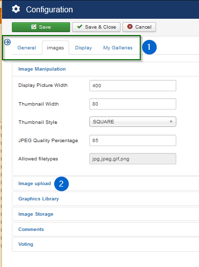
Above is the start view when selecting configuration
-
(1) There are four tabs to choose
- General: Debugging and SEF
- Images: Image related settings
- Display: Frontend view relating settings
- My Galleries: Settings for user galleries
-
(2) Sections in Tab
Each Tab contains sections. A click on a section will open or hide the settings within while the other sections stay open or hidden
General
-
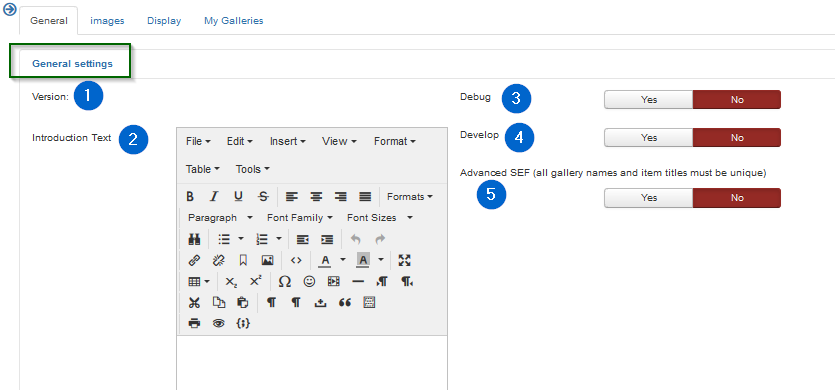
(1) Version:
Tells the actual uploaded RSG2 version.
-
(2) Introduction Text
This text is used as a broad header description of the "root gallery" view. The root gallery (with sub galleries and more) will be displayed when the menu type "RSGallery2 -> View of galleries" is activated and the root gallery is chosen for display
-
(3) Debug (Frontend / Backend)
Activates debug functionality. This does write calling parameters and logs some of the used files / classes in a log file.
Attention: On Yes to Debug a log file per day will be created in folder '...//joomla root/administrator/log' and notices may appear on top of a form. Please delete log files regularly". In Maintenance will (may be in near future) be a button to achieve this
Actually (22.07.2018) Using debug on the frontend will create a lot of text in the log files and may get stuck when a lot of users are active. It is best used on the local test web then.
Therefore in the near future the team will introduce different debug variables for backend and frontend
-
(4) Develop
Activates developer functions. Additional 'info' will appear in HTML pages and more functions appear in maintenance view. The additional function may not work or destroy parts of RSGallery2 ....
-
(5) Advanced SEF
All gallery names and item titles must be unique
Images
Images: Image Manipulation
-
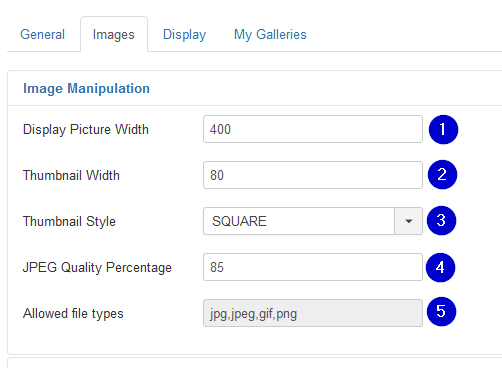
(1) Display Picture Width
Standard size of displayed image. The downloaded file will be resized to this width for the standard display of the image. The original image is still kept for modal display when clicking on a gallery image
-
(2) Thumbnail Width
Defines the with of the small images (thumbs) in gallery tile view
-
(3) Thumbnail Style
The thumbnail may be sized (styled) for "Square" or "Proportional" dimensions. In "Square" Style the height of the thumbnail is the same as the width. In "Proportional" Style the height is calculated according the width/height proportions of the original image.
-
(4) JPEG Quality Percentage
Defines the quality factor will be used by the resizing from original image to the displayed image
-
(5) Allowed file types
This information tells which file types are supported. The types are defined by the component and therefore can't be changed
Images: Image upload
-
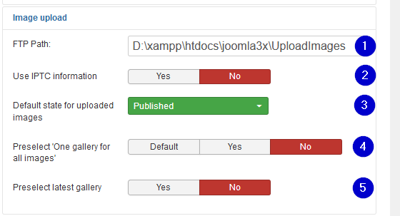
(1) FTP Path:
Used as initial value in upload (ftp tab) form. Used for uploading images from folder path on remote server. Path must start with base path to the joomla! installation
-
(2) Use IPTC information Yes No
If set to yes: If a file has IPTC information in the fields title (2#005) and description (2#120), then this information will be used upon import of an image in RSGallery2, unless the title and description fields shown in the import steps are used.
If set to no: IPTC information will not be used.
-
(3) Default state for uploaded images
Select between "Published", "Unpublished", "Archived" or "Trashed"
If a user has either Edit State permission or Edit State Own permission and he uploads an item in a gallery he owns (e.g. the user is allowed to change the state from Published to Unpublished and vice versa for images in the selected gallery), then this value indicates whether the uploaded images will be (un)published by default. This setting applies to Frontend as well as Backend, and for single file and batch upload.
For users without Edit State permission the default state is Unpublished.
-
(4) Preselect 'One gallery for all images', Default Yes No
Preselect state for upload form. Yes: Use selected gallery for all images. No: select images in second step
-
(5) Preselect latest gallery Yes No
Preselect the 'Latest gallery' name as default selection in upload form
Images: Graphics Library
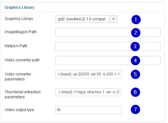
-
(1) Graphics Library
Old:
Three graphics libraries, GD2, ImageMagick (and Netpbm, are supported if they exist on the server. They are used to make display and thumb-nail images on upload of imagesActually only GD2 is used until further notice
-
(2) ImageMagick Path
Path to the ImageMagick library on the server
-
(3) Netpbm Path
Path to the Netpbm library on the server
-
(4) Video converter path
Videos are actually not supported
-
(5) Video converter parameters
Videos are actually not supported
-
(6) Thumbnail extraction parameters
Video Thumbnail are actually not supported
-
(7) Video output type
Videos are actually not supported
Images: Image Storage
-
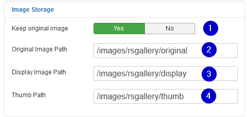
(1) Keep original image Yes No
On "yes" the original image will be deleted after the upload process for server space or hiding purposes. On a double click of the display sized image the same image (size) appears then in the popup
Drawback: watermark images not created on upload will use the smaller size "display" image to be build when the user opens the 2original" view"
-
(2) Original Image Path
Select any folder within the Joomla! reachable folder system. You may choose a different folder when you don't show the original images by setting the "Popup style to none" in Configuration -> Tab "display" -> section "Image display". This makes it harder for any user to guess the origin folder to download the original image with big size and good quality .
-
(3) Display Image Path
Select any folder within the Joomla! reachable folder system for the resized displayed images.
-
(4) Thumb Path
Select any folder within the Joomla! reachable folder system for the thumb images.
Future folder structure (2018.07.22)
Actually all images of a certain type are kept in one folder. This limits its use as the amount of files per folder is limited. It may limited to 60000 files on older systems and around 4 GByte files on newer systems. Anyhow the system catches performance issues after too many files in one.
The development team aims for folder per gallery so other slide shows may benefit from this too.
Images: Comments
Comments are activated in configuration under Tab "Display -> section "Image display"
-
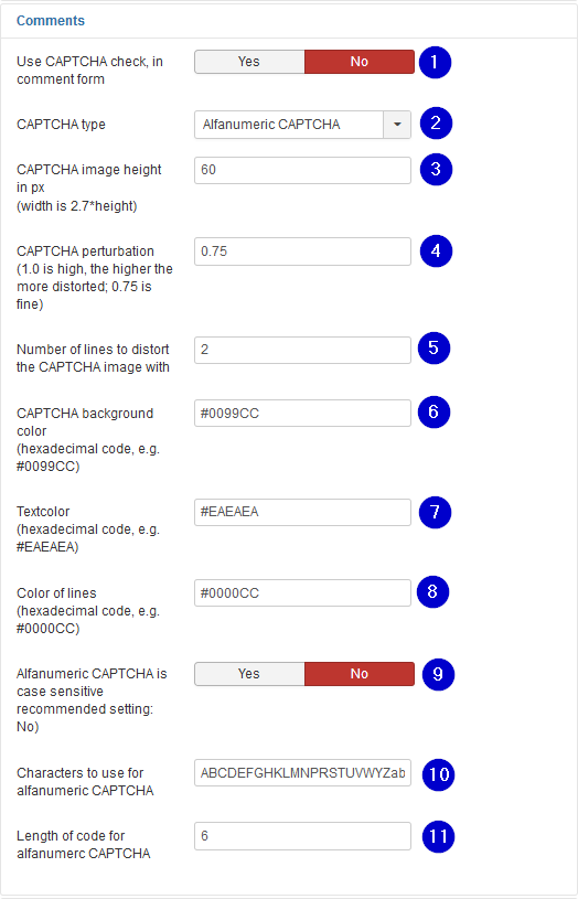
(1) Use CAPTCHA check, in comment form Yes No
.
-
(2) CAPTCHA type
.
-
(3) CAPTCHA image height in px (width is 2.7*height)
.
-
(4) CAPTCHA perturbation (1.0 is high, the higher the more distorted; 0.75 is fine)
.
-
(5) Number of lines to distort the CAPTCHA image with
.
-
(6) CAPTCHA background color (hexadecimal code, e.g. #0099CC)
.
-
(7) Textcolor (hexadecimal code, e.g. #EAEAEA)
.
-
(8) Color of lines (hexadecimal code, e.g. #0000CC)
.
-
(9) Alfanumeric CAPTCHA is case sensitive recommended setting: No) Yes No
.
-
(10) Characters to use for alfanumeric CAPTCHA
.
-
(11) Length of code for alfanumerc CAPTCHA
Images: Voting
Voting is activated in configuration under Tab "Display -> section "Image display"

-
(1) User can only vote once (cookie based) Yes No
Defines if a user can vote multiple times ToDo: ? overwrites old voting or adds further voting
-
(2) Cookie prefix
A cookie is used to track the user on voting. Assign a singular prefix only used from your web site
Display
Display: Front Page
-
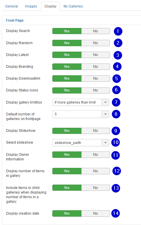
(1) Display Search Yes No
Displays a search rectangle over the gallery display. The user may search for images where the name or the description matches the search text.
-
(2) Display Random Yes No
On yes an area appears below the standard gallery where Random images are displayed
-
(3) Display Latest Yes No
On yes an area appears below the standard gallery where Random images are displayed
-
(4) Display Branding Yes No
On Yes a text with rsgallery2 information including used version will be shown on the bottom of the single images view
-
(5) Display Downloadlink Yes No
On yes a small thumb with download text appears below the image in the single image view. When the user clicks on it then the original image (big size) is downloaded
-
(6) Display Status Icons Yes No
On Yes activates icons with the status of a gallery above the gallery thumb when the user is logged in. This helps if "user galleries" are enabled in "MyGallery" configuration to show the states of the actual gallery.
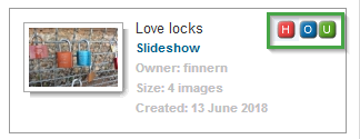
The icons will indicate
- (O) User is the owner of the gallery
- (U) User can upload in this gallery
- (H) The gallery is hidden and not Published
-
(7) Display gallery limitbox
With a displayed gallery limit box the user can choose the maximal number of galleries shown on the viewed page. So he may overwrite the configuration parameter "Default number of galleries on frontpage" and see more or less galleries to choose from.
Possible options
- Always
- If more galleries than limit
- Never
on "If more galleries than limit" this selection box will only appear when there are more galleries to be displayed but limited by parameter "Default number of galleries on frontpage". See below
-
(8) Default number of galleries on frontpage
This limits the galleries displayed to the user. This can be overwritten by the user with a limit box if the box is enabled. See parameter "Display gallery limitbox" above
-
(9) Display Slideshow Yes No
On yes a link is displayed beside the gallery thumb nail which displays on click the selected slide show
-
(10) Select slideshow
Possible options
- slideshow_parth
- slideshow_pathfusion
- slideshowone
Sadly slideshow_pathfusion is not working actually and slideshowone is not that interesting (2018.07.26).
The RSGallery team is working on boostrap and other slide shows in the near future -
(11) Display Owner Information Yes No
On Yes the owner information is displayed on the right side of the gallery thumb
-
(12) Display number of items in gallery Yes No
On Yes the size of the gallery (image count) is is displayed on the right side of the gallery thumb
-
(13) Include items in child galleries when displaying number of items in a gallery Yes No
Defines the type of images count of the view of previous configuration parameter
-
(14) Display creation date Yes No
On Yes the owner information is displayed on the right side of the gallery thumb
Display: Image Display
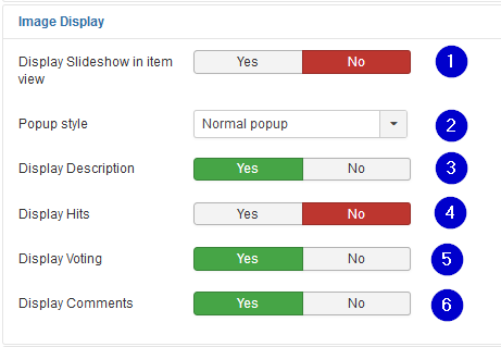
-
(1) Display Slideshow in item view Yes No
Adds a "slideshow" link to the single image view. It leads to a page displaying the selected type of slideshow
-
(2) Popup style Defines the method ("No popup", "Normal popup", "Joomla Modal") used for displaying a popup (big image) after a click of the image in single image display.
"No popup": A click on the image does not open a popup
"Normal popup": After click on the image the original image is displayed in a separate browser window style
"Joomla Modal": After click on the image a popup in a modal style with to close appear in front of the small image screen -
(3) Display Description Yes No
On "Yes" a rectangle below the single image display is added. It contains a header with title "Display" and below a field where the description of the image is displayed.
-
(4) Display Hits Yes No
On "Yes" a rectangle below the single image display is added. It contains a header with title "Hits" and below a field where the number of "hits" of the images is displayed.
-
(5) Display Voting Yes No
On "Yes" a rectangle below the single image display is added. It contains a header with title "Comments" and below a field where comments can be inserted.
-
(6) Display Comments Yes No
On Yes a rectangle below the single image display is added. It contains a header with title "Comments" and below a field where comments can be inserted.
Display: Image order

-
(1) Order images by
The displayed imaged may be ordered by the types "Default", "Date", "Name", "Rating" or "Hits
-
(2) Order direction
The appearance of order type (see above) can be displayed in ascending or descending order
Display: EXIF settings
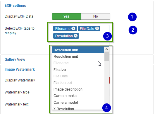
-
(1) Display EXIF Data Yes No
If the image contains EXIF data these may be displayed as info in a rectangle below the image in the single image view It appears beside Description, Voting and Comments in a separate table part
-
(2) Select EXIF tags to display
Select the information which shall be shown to the user. Multiple selections are supported
-
(3) Selected items box
A items listed here are selected for display
-
(4) Possible properties list
Shows a list of selectable EXIF properties. Inverted items are selected
Display: Gallery View
Gallery view appears when the user selected a gallery with a click on the gallery thumbs It displays image thumbs with information about the imaged

-
(1) Thumbnail Style:
"Table", "Float" or "Magic" Use float for variable width templates sorry "Magic" -> not supported (yet) "Table": The thumb nails are embedded in table elements
"Float": The thumb nails are embedded in an unordered list -
(2) Direction (only works for float) Assigns the direction "Left to right" or "Right to left" of the unordered list elements
-
(3) Number of Thumbnail Columns (only for table)
Number of thumbnails in a row
-
(4) Thumbnails per Page
Set the maximum thump nails displayed on one page. There will be a page navigation displayed if the gallery contains more images.
-
(5) Show image name below thumbnail Yes No
On yes the image name will shown below the thumbnail
-
(6) Navigation bar display
Adds a navigation bar in the single image display of the gallery Possible selections: Top, bottom, both, none
-
(7) Display Slideshow in gallery view Yes No
Adds a "slideshow" link to the gallery view. It leads to a page displaying the selected type of slideshow
Display: Image Watermark
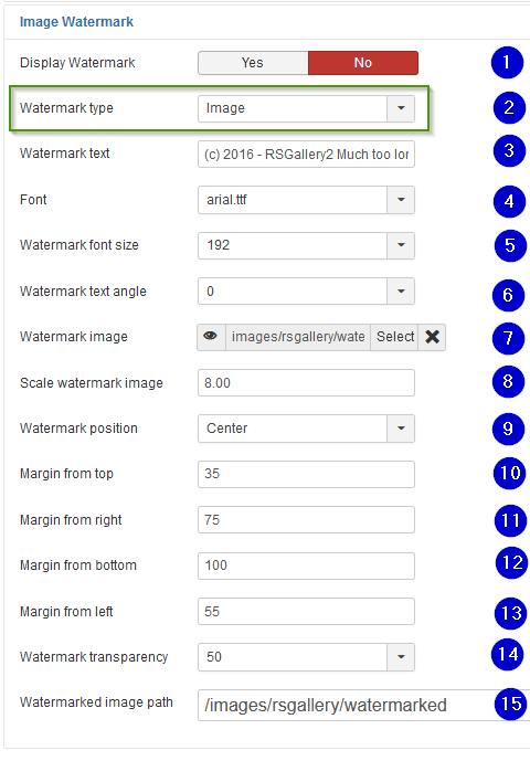
If you consider using watermarked files see also description "How to hide the original image from the user"
-
(1) Display watermark
Activate if watermarked files should be used on "big size" image view. It will replace the original file which would be displayed otherwise.
A watermarked replacement file will be created once when uploading or when viewed the first time. The watermarking will be a text defined in the configuration.
Optional: Add icon or other image as watermark. (This has to be developed. It can be done in short time. Send us an email if you need it and we will care for it) -
(2) Watermark Type
The watermark may be merged from "text" or from an "image" into the display image
-
(3) Font
Select the font type of the watermark text
-
(4) Watermark text
Define the text to be displayed in the image
-
(5) Watermark font size
Select the font size of the watermark text
-
(6) Watermark text angle
Define the angle of the watermark text
-
(7) Watermark image
Will be merged into the big display image. Watermark image should be smaller then display image
-
(8) Scale watermark image
Enter a factor to enlarge the watermark image. 1.0 will use the original. Smaller values will reduce the watermark image size
-
(9) Watermark position
Select the position of the watermark text
-
(10) Margin from top
-> Not used
-
(11) Margin from right
-> Not used
-
(12) Margin from bottom
-> Not used
-
(13) Margin from left
-> Not used
-
(14) Watermark transparency
Define transparency of the text to be displayed in the image. A higher value makes the watermark more transparent. Transparency of 100% makes the watermark invisible
-
(15) Watermark image path
Define the destination path of the created watermarked files
My Galleries
My galleries supports the creation of user galleries
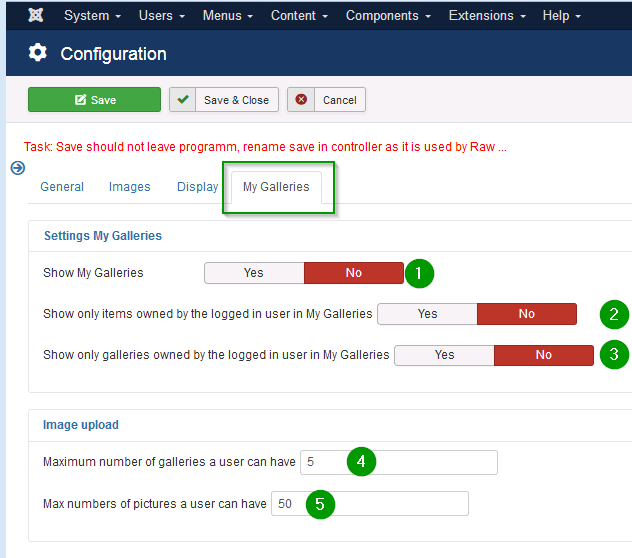
Settings My Galleries
-
(1) Show My Galleries
On yes it activates this functions
-
(2) Show only items owned by the logged in user in My Galleries
Restricts the shown images on front end to users who own the image and who are logged in.
??? The images of the user may be in several galleries owned by other people. ???
-
(3) Show only galleries owned by the logged in user in My Galleries Yes No
Restricts the shown galleries on front end to user who own the gallery and who are logged in.
Image upload
-
(4) Maximum number of galleries a user can have
Restrict the amount of galleries a user may create
-
(5) Max numbers of pictures a user can have
Restrict the amount of images a user may upload. It counts number of images over all galleries

